Don't Go Near the Water is a data visualization project of the 1854 Cholera outbreak in London.
This application can be used to look at the data from the 1854 cholera outbreak in London.
To use the application, open the application in your browser, or download the files and load them into R Studio
You can look at the application online at this link or you can download the files here
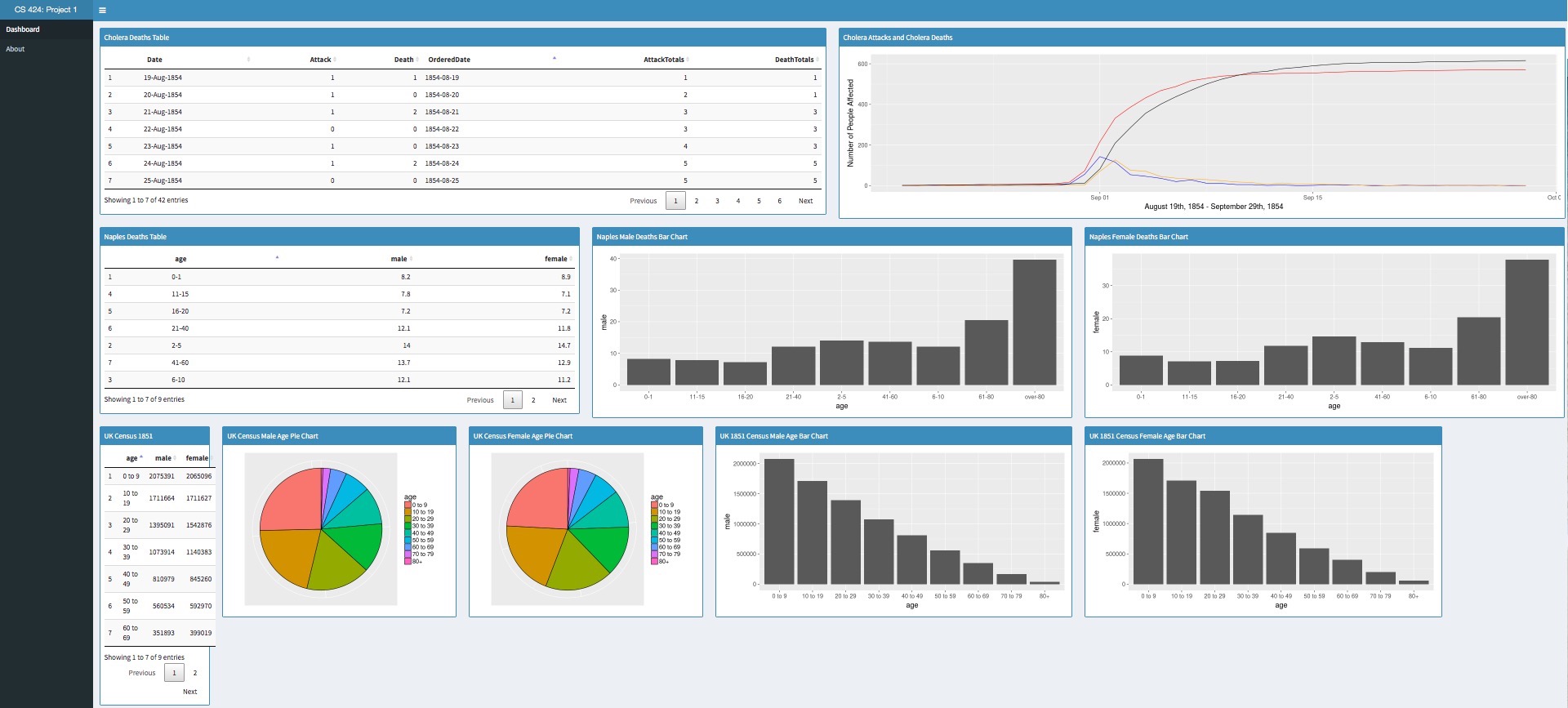
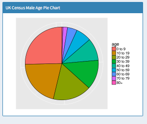
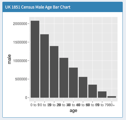
In the application, you can look at the different statistics on cholera deaths in London, compared to cholera deaths in Naples, and population data from the latest UK Census at the time.
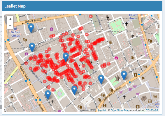
The application also provides a Leaflet map that maps the locations of the cholera deaths on a map of London, and shows the proximity to the water pumps at the time.
Programming Language
IDE
Dashboard Tool
Central code repository for website.
The data utilized was chosen by the professor of the course, Dr. Andy Johnson.
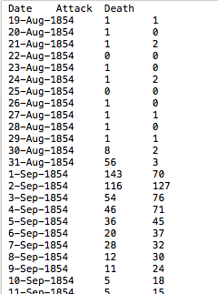
It included data on the date and location of cholera outbreak deaths and attacks, and data on the population of the UK at the time, and comparative statistics to cholera deaths in Naples.
For the application, I created bar charts and pie charts using the ggplot library once the data was processed into R Studio.
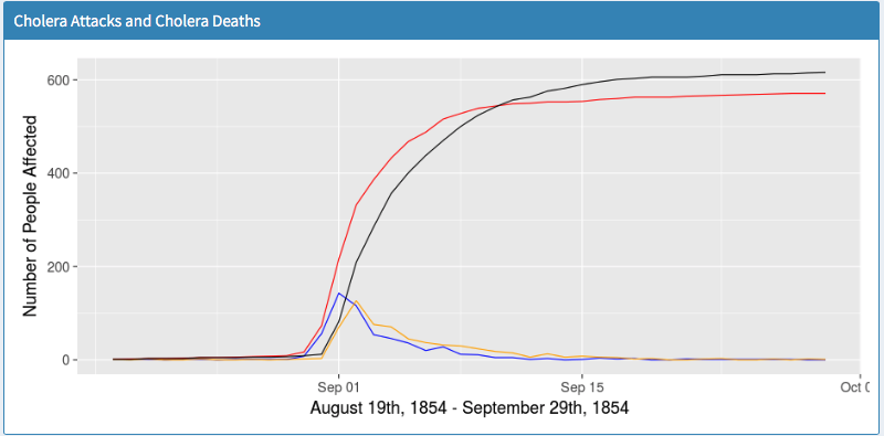
Overall the data visualization does support John Snow's belief that the water pump on Broad Street caused the cholera outbreak. On the leaflet map that was created, the locations of the deaths all surround the Broad Street pump, and do not form a similar pattern around the other pumps.
Additionally, from the line chart, it is obvious that there was a single incident around September 1st
that caused the majority of the cholera deaths. If it had been multiple water pumps that were contaminated,
there might have been multiple large spikes in deaths, as opposed to one large spike.