Learning to Fly is a data visualization project of airport flight data in Chicago.

View the Alpha Release

Youtube Video

Link to files

Progress

Weekly Summary: Feb 24, 2018

Guillermo Rojas Hernandez progress: This week I focused on customizing the base template for the main Learning to Fly web page, and creating the base Shiny script and first visualizations for the Shiny application for Project 2.

Yang Hao progress: This week I focused on working with the data set using R. An overview of my work is in this webpage

Natasha Rice progress: This week I focused on downloading the data, cleaning up the data set, setting up the project on GitHub, and doing some of the initial R work on the dataset.

Siddharth Basu progress: This week I focused on learning more about the Shiny dashboard, coming up with ideas for the dashboard visualization, and doing some R work on the dataset.

Weekly Summary: March 2, 2018

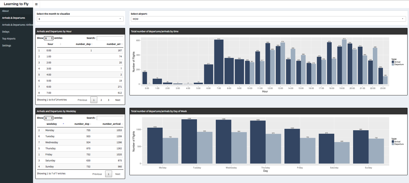
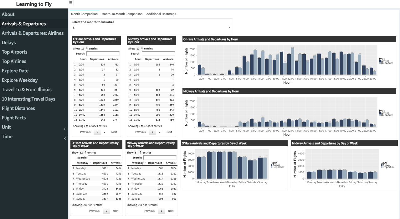
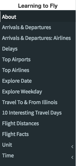
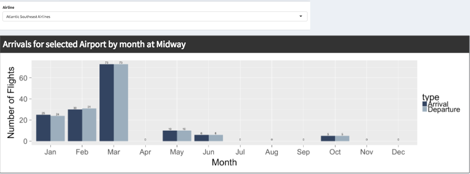
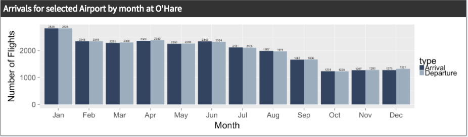
Guillermo Rojas Hernandez progress: This week I set up the first draft of our application on the classroom Shiny server, and I also tested the application on the large class display. In addition, I created the initial table that displayed the top 15 arrivals and departures from Midway. I also created drafts of the Shiny Dashboard that fulfill the requirements from sections C to A, and updated the website describing our progress.

Yang Hao progress: This week I

  • Created and organized the data sets needed to fulfill the section C requirements.
  • Created the percent() and switch_hour() functions.
  • Finished 5 different tables of data for the Shiny dashboard.
  • Made the dashboard reactive to the hour format and the selected airport and month.
  • Screenshots of the tables I created can be found in this PDF.

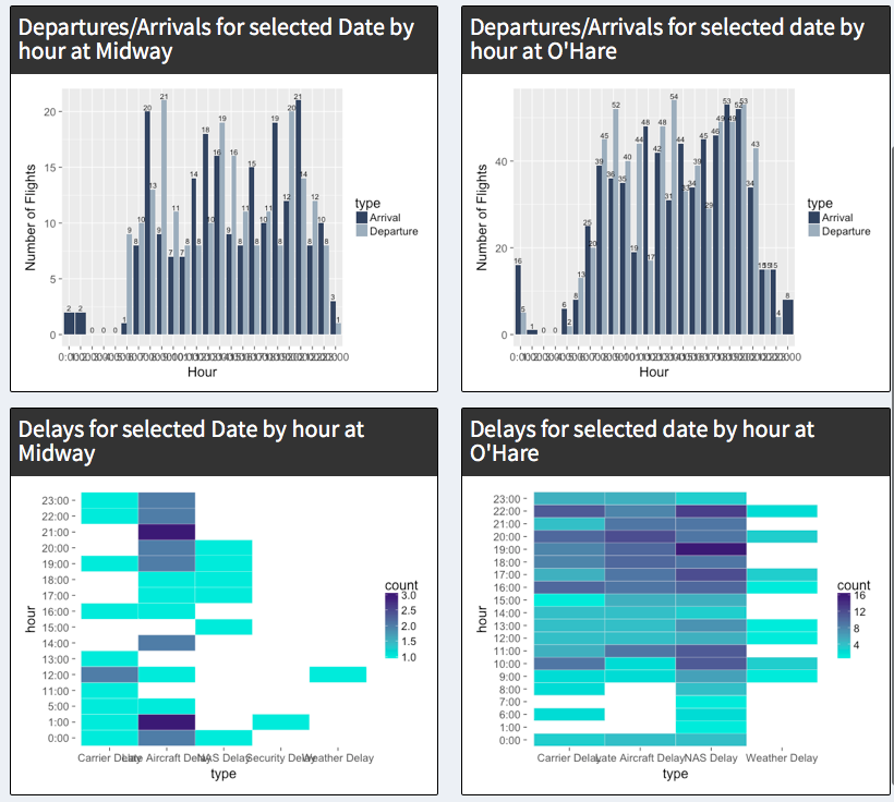
Natasha Rice progress: This week I created the required bar charts for the section C requirements. I also selected a color palatte for consistency among the charts.

Siddharth Basu progress: This week I focused on helping create drafts of the Shiny dashboard and on sketching different ways to graph the data.

Weekly Summary: March 8, 2018

Guillermo Rojas Hernandez progress:

  • Created a prototype of the complete application
  • Re-organized some of the Shiny app code to make it easier to edit
  • Created new columns in some of the tables to show both Midway and O’Hare data
  • Added in the ability to select the airport on each page
  • Added the remaining charts and tables to fulfill the C requirements of the application
  • Edited different sections of the Shiny app using CSS, and resized objects on the UI
  • Yang Hao progress:

  • Work on some interactive features: allows user to pick type of delay and show delay data.
  • Create input box for selecting delay type. Filter data for 24 hours and 12 months according the selected type
  • Finished 5 different tables of data for the Shiny dashboard.
  • Design some reactive features for picking date for more information
  • Try to integrate a few features in one box.
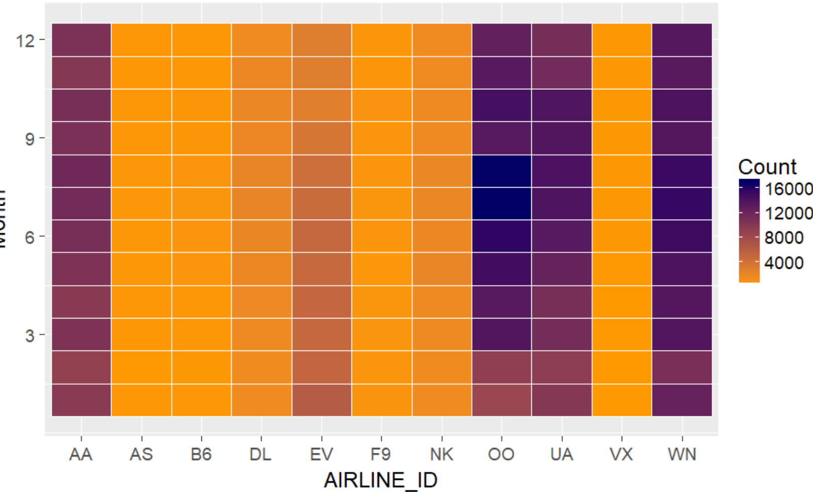
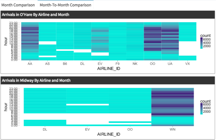
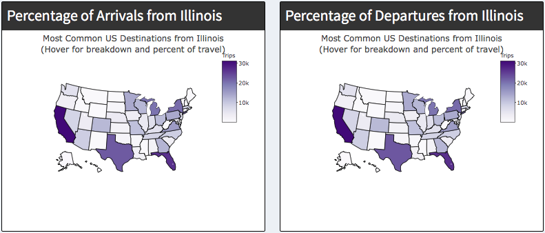
  • Natasha Rice progress: This week I modified the R-files read in process to optimize read in speeds, optimizing start time from 25 seconds to 10 seconds. I also created heat maps for part B. Picture below is Airline Arrivals from Airports

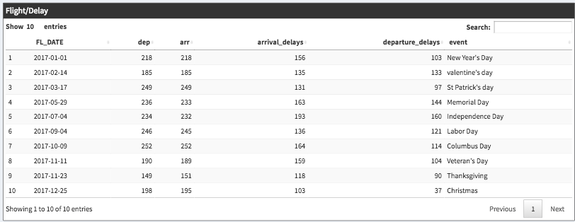
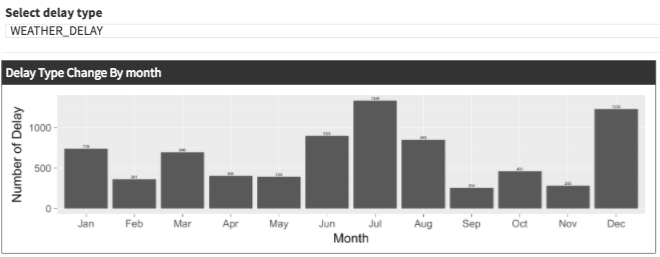
    Siddharth Basu progress: This week I focused on the UI aspect with coming up minimizing data visualizaion by scalability. Currently working on section A: Interesting Days, in which I set up the tab and looking at the data for spikes and dips. I also became co-admin with Guillermo to manage the project website.

    Weekly Summary: March 16, 2018

    Guillermo Rojas Hernandez progress:

  • Worked on getting a latest draft of the project to work on the EVL server
  • Researched possible data sets to integrate for the graduate portion of the project
  • Looked into heat map customizations for our chart
  • Yang Hao progress:

  • Pick a type of delay for more info on how it changes over a 24 hours of the day and the 12 months of the year.
  • Pick a destination/arrival airport from the top 50 and see how the number of flights to and from the location change over the 24 hours of the day and the 12 months of the year
  • Natasha Rice progress:

  • Figured out how to add days/months/hours that had no data so that the x- and y-axis' made sense.
  • Worked on getting project onto the EVL shiny server with Guillermo
  • Completed a map displaying the percentage of states arrival/departure in the us
  • Compleated picking a date and seeing data for that day.
  • Compleated picking a day of the week and seeing data for that day
  • Compleated picking an airline and showing that data by hour/month
  • Compleated allowing the user to compare delays over months.
  • Siddharth Basu progress:

  • Currently working on section A: Interesting Days
  • Further maintaince on website by setting up final project requirements
  • Learned new Rstudio libraries and implemented a sub menu tab (Interesting days)
  • Organized the weekly progresses and sent updates
  • Looked deeper into the raw datafiles and data tables with Natasha.

  • Data

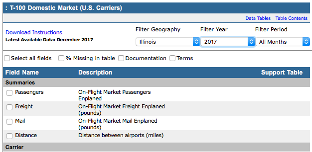
    The data utilized was chosen by the professor of the course, Dr. Andy Johnson.

    For the application, we created bar charts and pie charts using the ggplot library once the data was processed into R Studio.

    Manipulation of Data:

    • The data was cleaned and reduced by python script given by Professor Johnson. This script allowed us to turn CSV files to TSV files, with various lookup codes added.
    • For the Intereseting Days section, we were given more freedom, so we choose date datas in which we were familiar with: Christmas, Thanksgiving, New Year's Day. These are occasions that would increase definetly require someone to take a flight.
    • For the graduate section, an additional data set was taken from the Bureau of Transporation Statistics, Datasets, in which the data is presented the same way as Professor Johnson, but further more variables like pasanger, distance, class, etc. It let us even specify the geographic location and click on each individual catagory variable to create a custom table for our requirements. This gave us a wide range of possible implementations of this data and how we can merge them into our project.
    • For the Top 50 Aiports section, we pooled the airport data from both O'hare and Midway and then pulling Top 50 airports from the pooled data. This way we are visualizing the data at state level and compare it national level with other airports like LAX, ATL, HOU, etc.

    Libraries used:

  • Shiny/ShinyDashboard
  • ggplot2
  • lubridate
  • DT/data.table
  • dplyr
  • plotly
  • jpeg
  • leaflet
  • fasttime
  • ggridges
  • ggrepel
  • gridExtra
  • ___________________________________________________________________________________________________________________


    Insights on How to Use

      Below is the menu system we have made to organize our tabs

    • The application is broken into 11 sub menu items with two helper items: About and Settings
    • You select on the item you want and have options on top of each page which render the page
    • You have the option to change the units (Mile/Kilometer) and time format (24 hour/12 hour)
    • Each menu item is unique and come with a variety of premises that you can choose from: Airport, Time, type of sort, delay, specific time, airline, etc.

    Example#1: Find all the given flights in a choosen date with delay data

  • This requires us to be able to filter through multiple days, we should click on explore dates
  • The top of the page, there is date tab in which you enter the date in 2017 (Calender style)
  • The date entered, 2 bar graphs and 2 heat maps should render which give hourly data of flights
  • The date is an hourly break down for the date specificed and be able to see both aiports.
  • Example#2: Find Arrivals and Departures for both airports (Hourly/Monthly).

  • First lets locate the Arrivals and Departures which will bring up to monthly updates
  • The top of the page, there is month tab which lets you choose from (1-12)
  • After choosing your specified month, the tables and bar graphs change to that data.
  • We have a side to side comparison with ORD and Midway which gives the user more options
  • Now we can see arrivals and departures for both Illinois airports with clarity (Hourly).
  • If we want to see a month to month comparison, there is a tab on top, which allows us to switch to month to month comparison in a heat map format to visualize.
  • Interesting Thoughts:

    Authors